.jpg)


To design a custom typeface inspired by the visual language of sport, exploring how shapes, movement, and structural elements found in sporting environments can inform letterform design. By studying elements such as field and court markings, sports equipment, and the geometry created through athletic motion, the aim was to translate these forms into a cohesive typographic system. Alongside the typeface, the brief required the creation of a specimen book that showcases the character set and demonstrates the typeface in use through engaging layouts that reflect the rhythm, structure, and energy associated with sport.
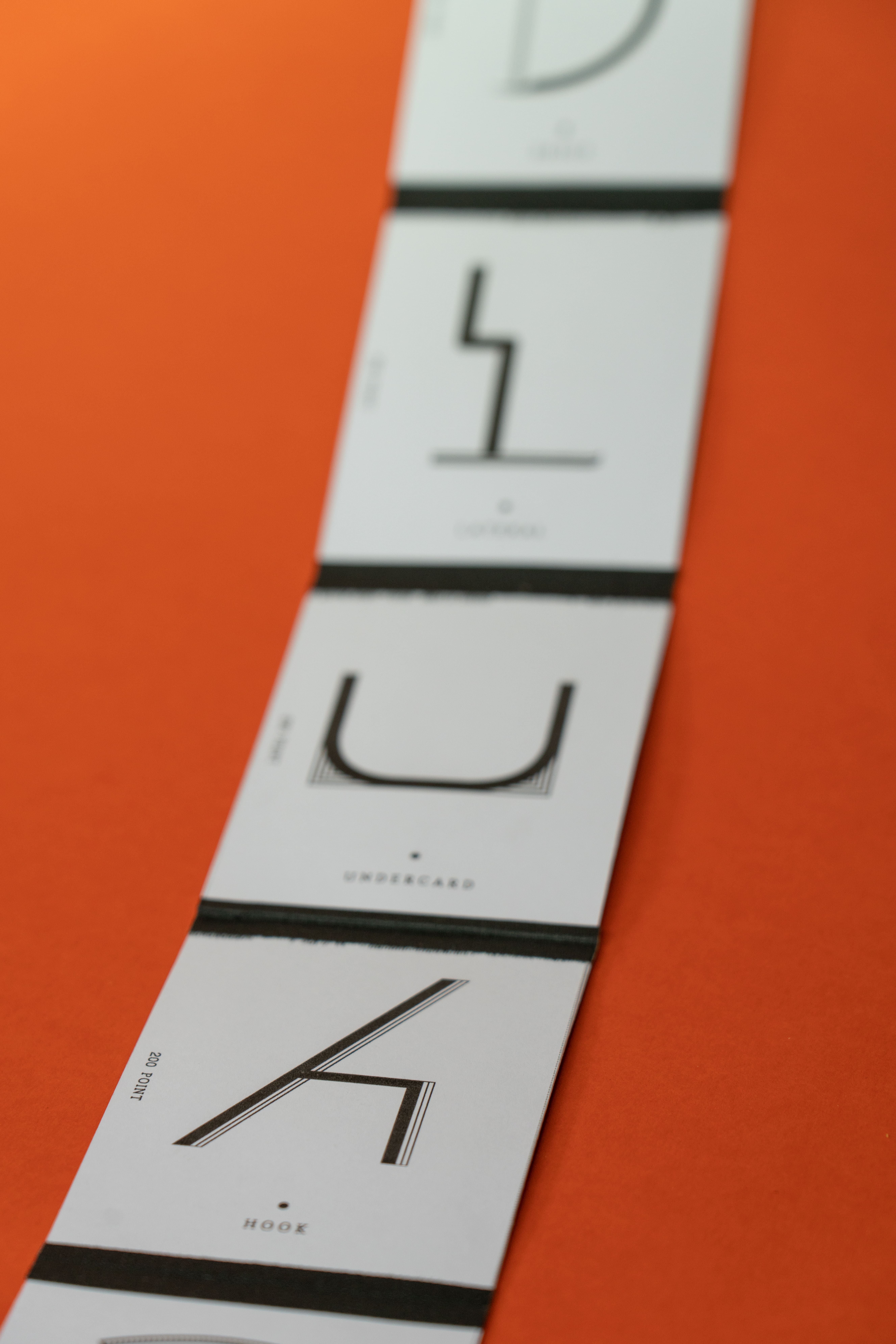
My concept began by researching visual forms found within sport, starting with a collection of sporting photography books. I selected a range of images and gradually reduced them to their most essential shapes, drawing inspiration from subjects such as the curved lines of a velodrome track to the linear simplicity of a pool cue. These distilled forms informed the construction of the typeface, translating sporting geometry into a set of clear, structured letterforms. For the specimen book, I drew inspiration from the ticket strips often found at sporting events, using this format to guide the layout and pacing of the publication. This approach reinforces the connection to the sporting environment while creating a tactile and recognisable format for presenting the typeface.