Hello to you too
You’ve made it this far, which I can’t help feeling is an excellent start.
I’m Tom, a British designer now based in Singapore. My work usually comes back to the same thing: storytelling. Whether it is graphic design, photography, or the very site you find yourself on now,
Since graduating, I’ve worked in a design agency in London, moved to Singapore, and spent time in the worlds of events and coffee, which may be less relevant, buuttt it’s my website, so it stays.
I’m interested in work that gives people something to engage hence why I’m drawn to modular design. It feels alive. It can be moved through, fiddled with, affected, and responded to, whether physical, digital, or somewhere in between.
Lately, I’ve been exploring UX, while photography has stayed close by. I’m especially interested in how places feel, how people move through them, and the details that make somewhere feel like itself.
Anyway, enough talking from me. Have your way with the site, and if you want to chat, the usual channels are below.
Brief

The brief was to refresh the brand for a local Thai restaurant, updating the visual identity while keeping the character that long-standing customers already know and love. The client wanted something more contemporary and refined to stay relevant to new customers, without losing what makes the brand recognisable. The challenge was finding the balance between modernising the look and respecting the heritage already built.

Idea

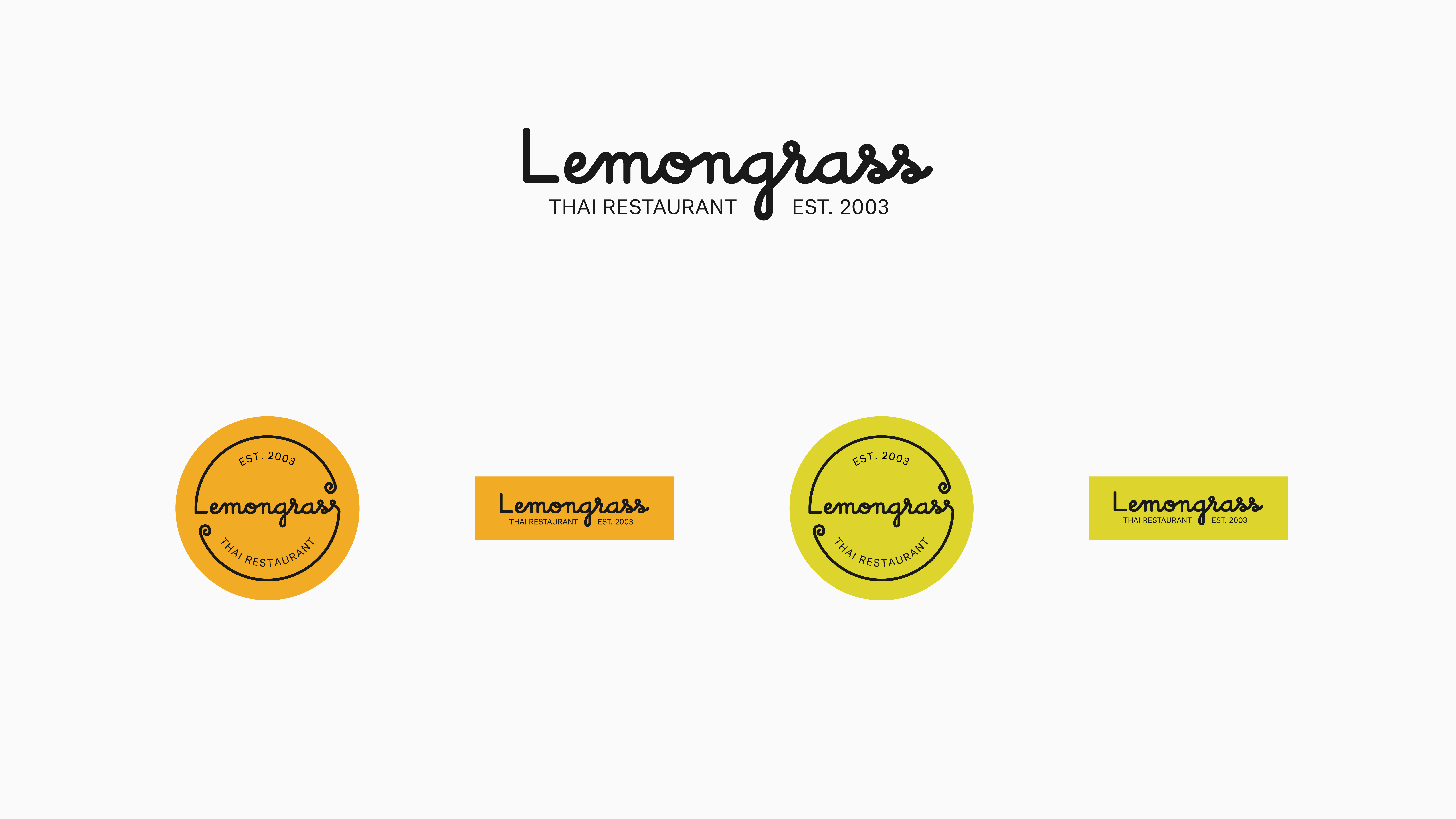
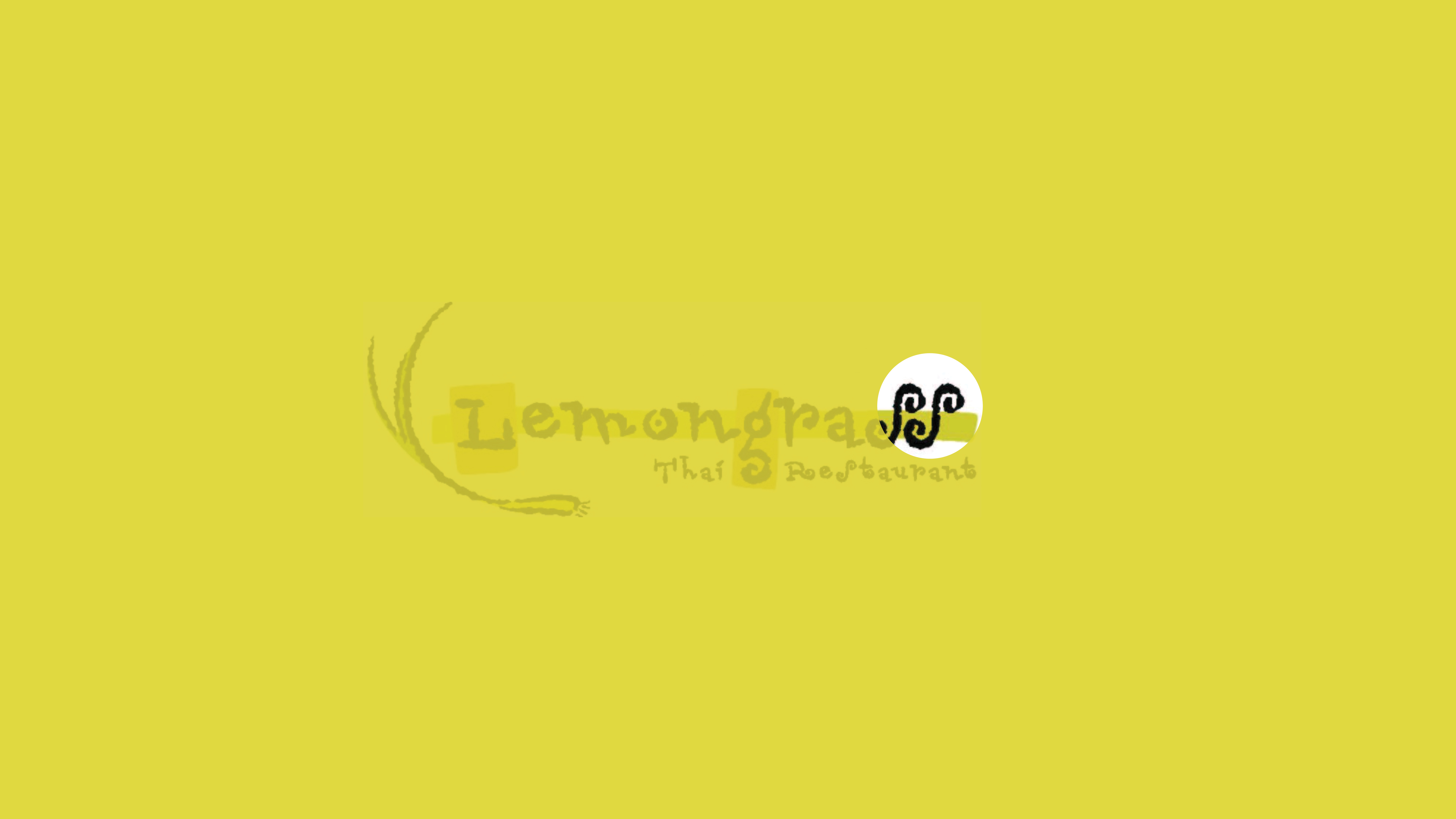
The concept focused on the curls and decorative details in the original logo, exploring how far they could be simplified and modernised while still feeling familiar. I presented a few directions, each isolating different elements of the original design, so the client could see how the identity might evolve while staying true to its roots.

The final direction keeps the familiar colours but brightens the palette to better reflect the vibrancy of the food, landing on a look that feels current without losing the restaurant's original character.

HELLO
NOTES
LEMONGRASS
IDENTITY
GRAPHIC
01
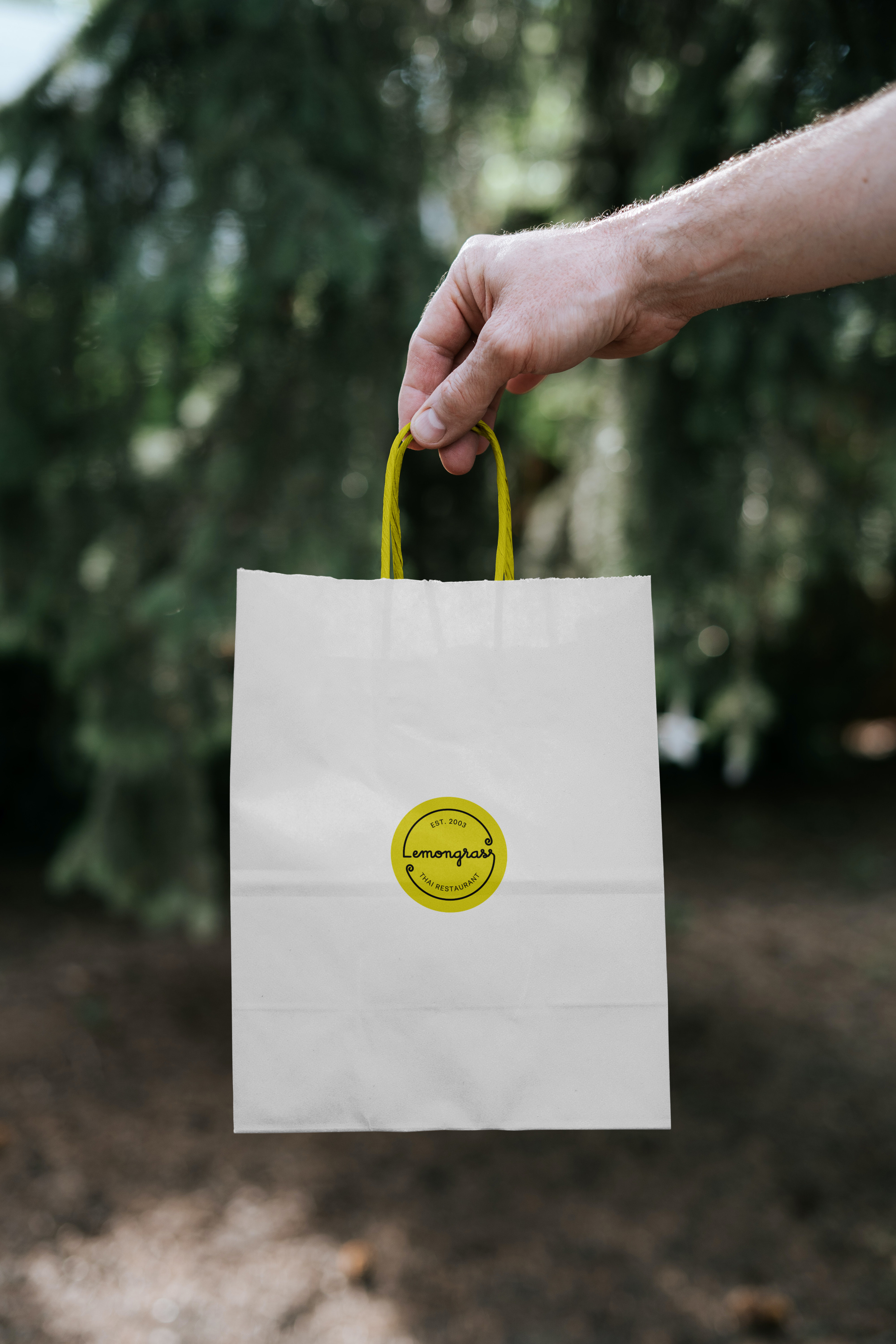
Animated stickers in two colourways, designed to be used interchangeably, showcasing the primary lockup across packaging and social media.
02
I took a single element from the previous logo, carrying over some of the flavour and identity that had already become recognisable to customers.
03-04
Full selection of logo lockups.
04
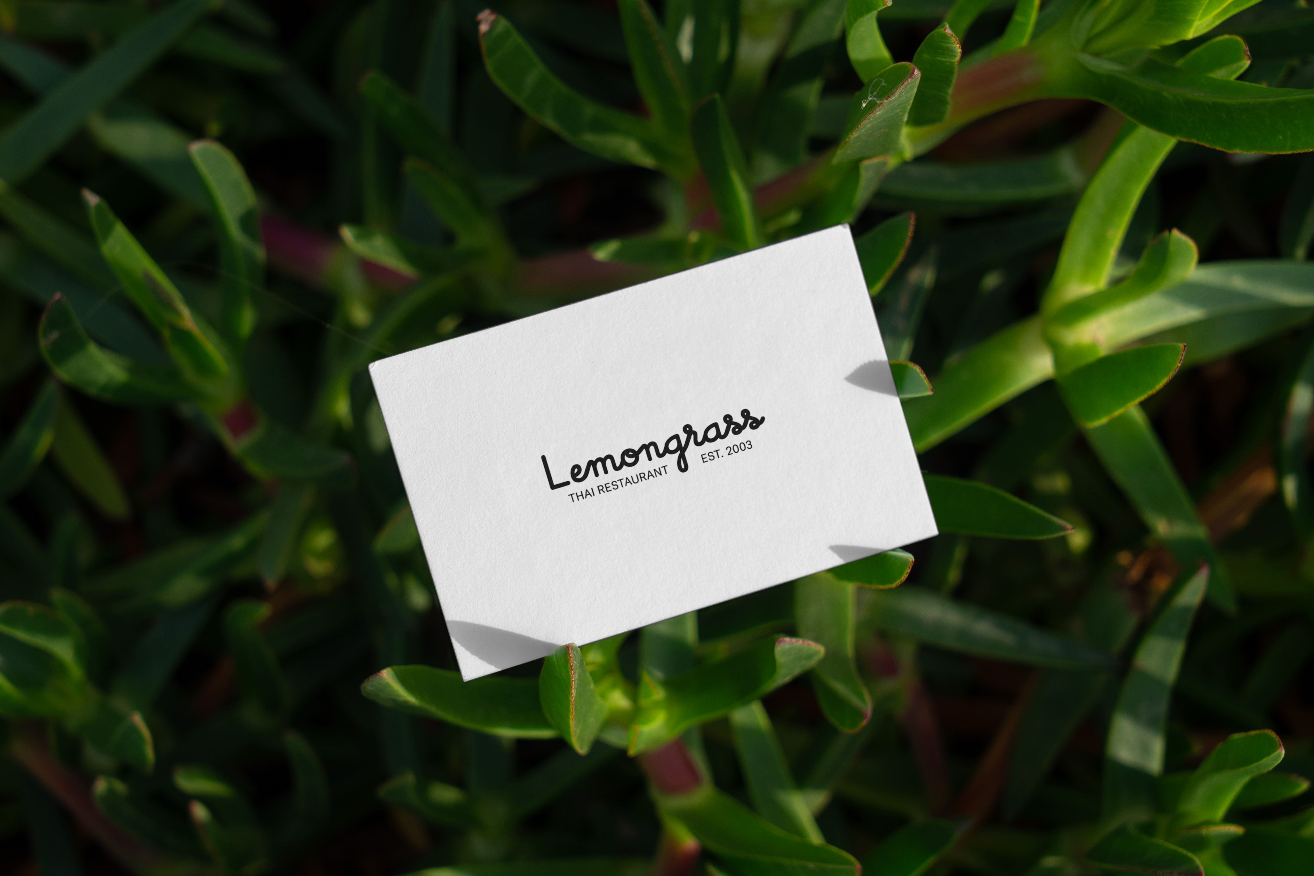
Real life examples.