Hello to you too
You’ve made it this far, which I can’t help feeling is an excellent start.
I’m Tom, a British designer now based in Singapore. My work usually comes back to the same thing: storytelling. Whether it is graphic design, photography, or the very site you find yourself on now,
Since graduating, I’ve worked in a design agency in London, moved to Singapore, and spent time in the worlds of events and coffee, which may be less relevant, buuttt it’s my website, so it stays.
I’m interested in work that gives people something to engage hence why I’m drawn to modular design. It feels alive. It can be moved through, fiddled with, affected, and responded to, whether physical, digital, or somewhere in between.
Lately, I’ve been exploring UX, while photography has stayed close by. I’m especially interested in how places feel, how people move through them, and the details that make somewhere feel like itself.
Anyway, enough talking from me. Have your way with the site, and if you want to chat, the usual channels are below.
Brief

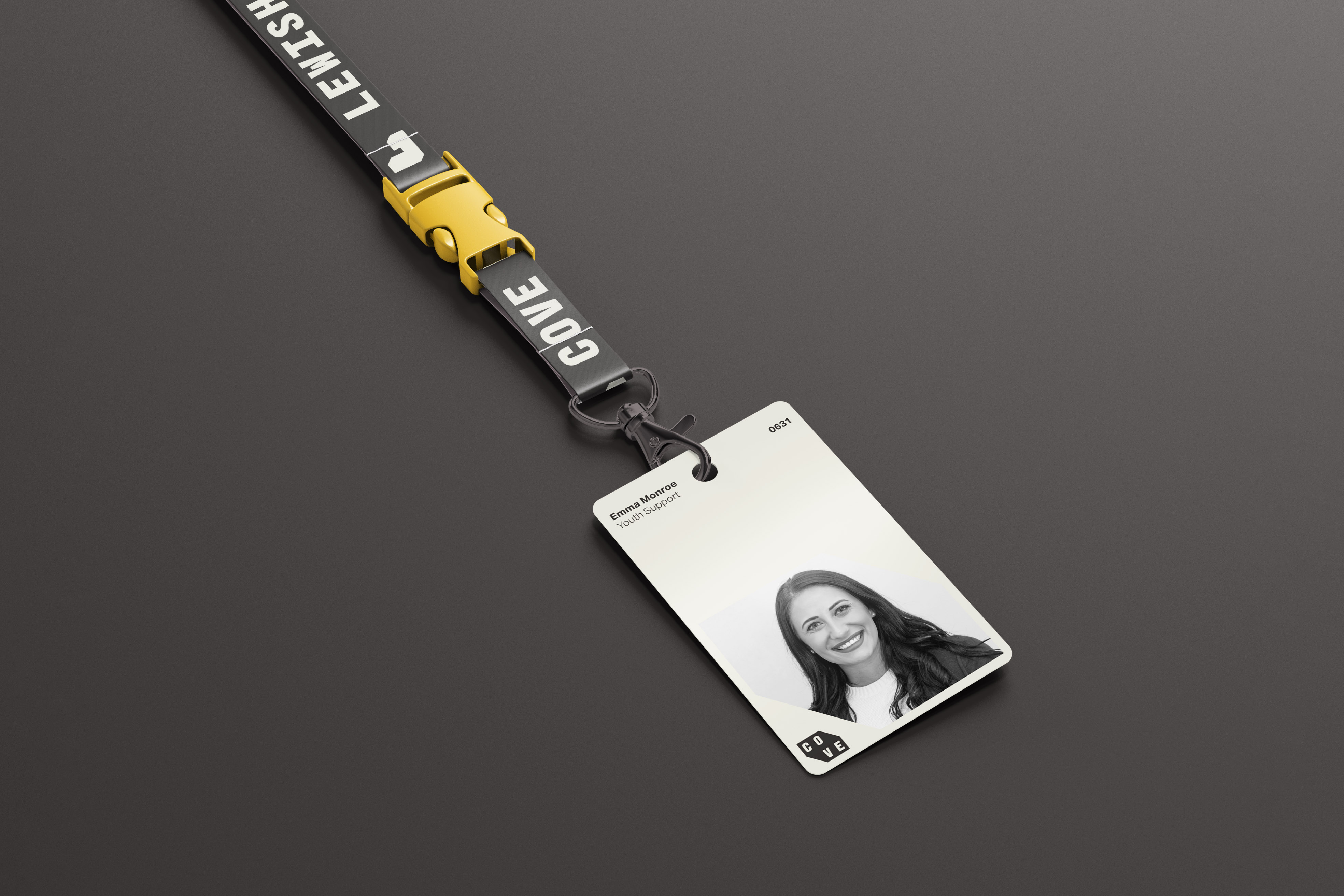
Cove is a new youth hostel and safe community space opening in central London, supporting teenagers and young adults facing homelessness, unstable housing, or looking to move away from crime, abuse, or substance misuse. It started life as an online support forum and has since grown into a trusted community network, now expanding into physical spaces that offer both accommodation and social support.

The new site in Lewisham will turn disused warehouse buildings into a hostel for over 100 residents, with shared social areas and an event space built to encourage connection and personal development. Ahead of a summer opening, the brief called for a bold, disruptive visual identity to raise awareness, guide marketing and campaign materials, and build a brand that feels like a genuinely safe space for young people.

Idea

The concept centres on the idea of building foundations, drawing on London's brutalist architecture to shape a bold, disruptive visual style. A custom monospace typeface reinforces this, echoing the structured, modular quality of building blocks.

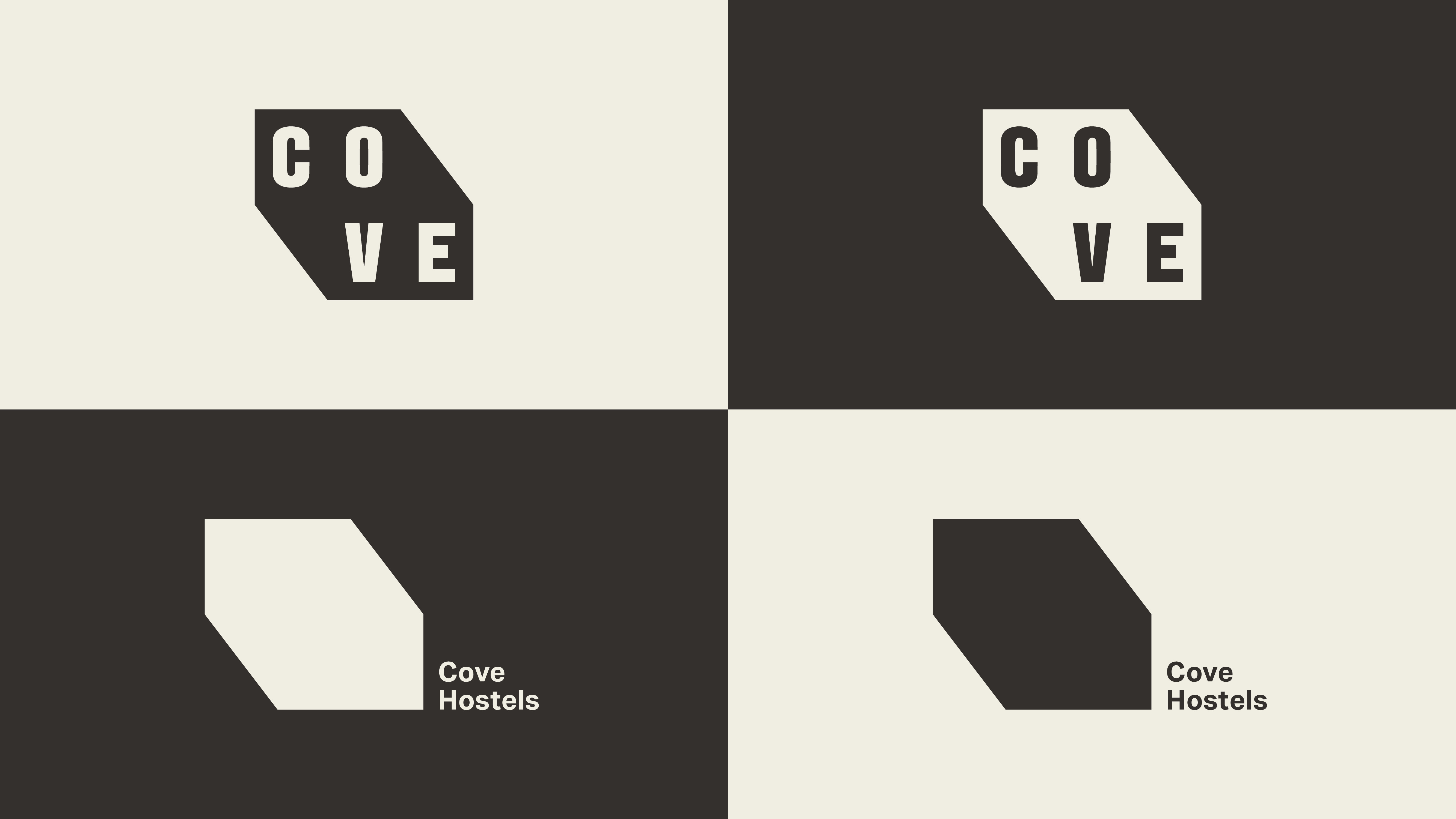
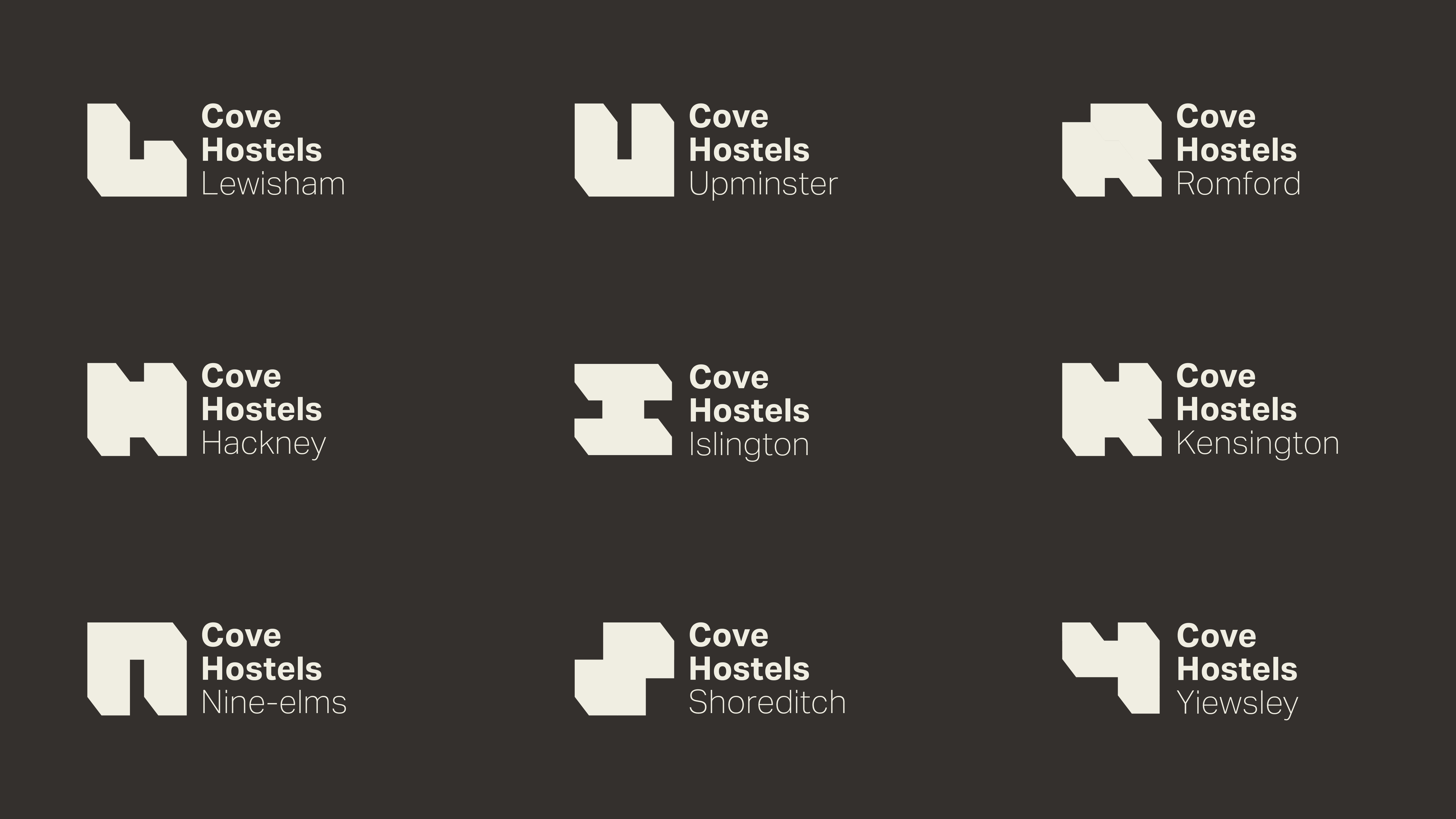
From there, I developed a flexible logo system built from a single "Cove brick," letting the identity expand and adapt as the hostel grows. The largely monochromatic aesthetic gives residents a neutral base to add their own expression and personality to the space. The branding becomes a foundation in more ways than one, supporting both the building and the community growing inside it.
HELLO
NOTES
COVe HOSTELS
IDENTITY
GRAPHIC
01
Introducing the concept of "building foundations," using the modular bricks that feed into the visual system.
02
Cove's top-level logo, built from the brick motif and a custom monospace typeface.
03-04
Introducing a flexible logo system, allowing for a more personal feel across future sites.
04
05
A custom alphabet built from the modular system.
06
An example application of the visual language, with the first considered use of the colour palette inspired by Le Corbusier.
07
The custom typeface, highlighted at large scale.